We Start With Good is an online resource full of tutorials and instructions on WordPress, design, development, and the Internet.
This is a collaborative project between me and my friend Aurooba—we’ve written all the articles. The site was also designed as a course platform, but hasn’t been fully developed for use.
Note: We Start With Good is currently in an interesting limbo. Aurooba and I worked together designing and developing websites as Wanderoak for over 5 years. We’ve decided to pursue separate goals (but absolutely remain as friends) and the fate of We Start With Good is yet to be decided. However, that’s no reason not to share the design details; a lot of love has been put into it! Please enjoy. 🙂
The Story
We Start With Good began out of a love for teaching and a desire to share what we know. It grew slowly as a side project—a place to share tutorials when the ideas popped into our heads; something to enjoy, pressure free.
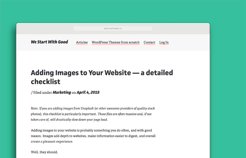
As such, the design was made to be simple—the words and instructions are centre-stage. The brand colours, typography, and aesthetic are friendly and open. We wanted to make sure the site didn’t feel intimidating; instead, we wanted it to be encouraging, inviting, and super usable, without any extra fluff getting in the way of the information.
Design Details
Find the information you need
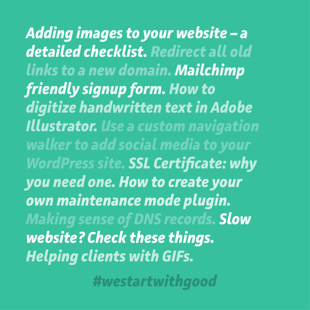
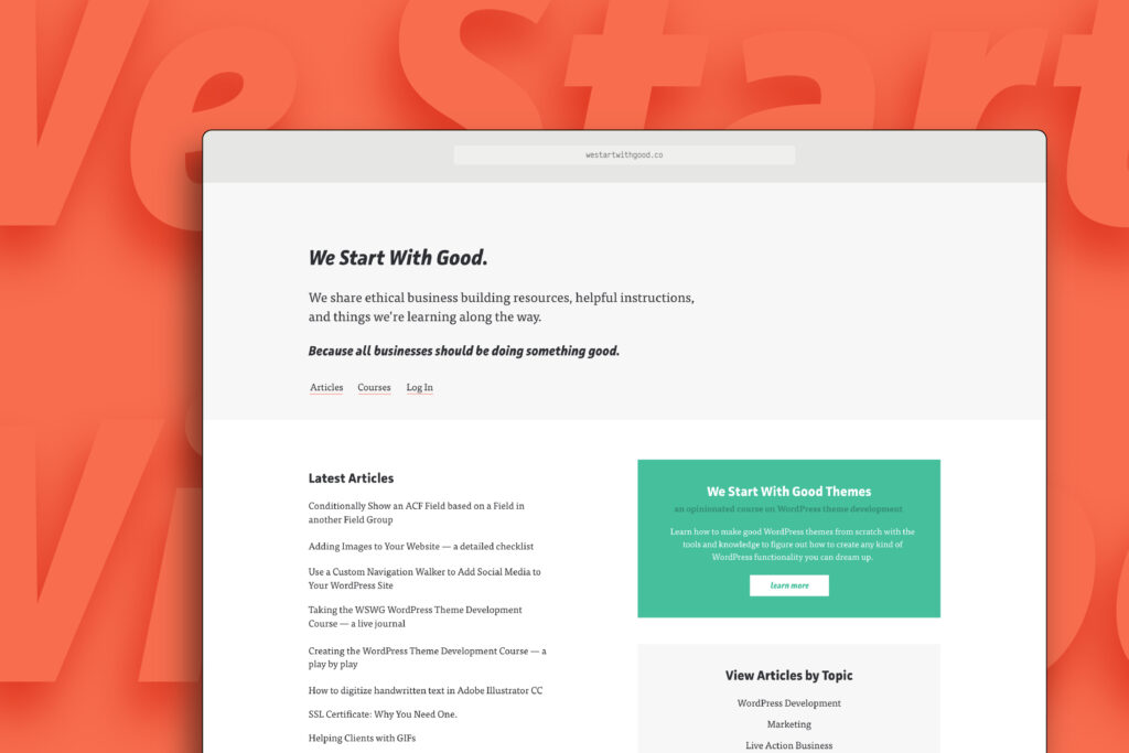
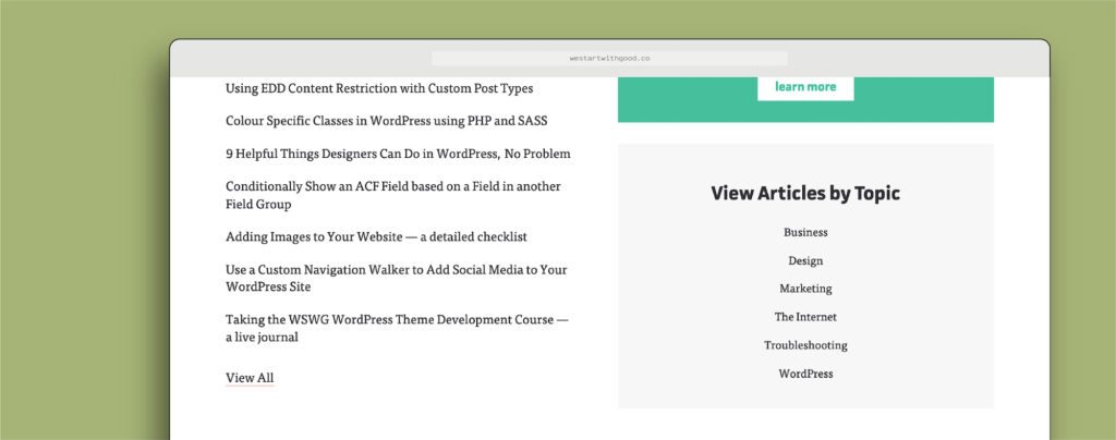
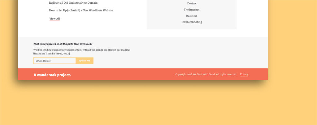
We started out with a simple list of article titles as the homepage. As the number of articles grew, we needed a better way to help people find the type of information they were looking for. To help, I re-designed the homepage with a View Articles by Topic section to help visitors find the articles that are most relevant to them.
Get updates
We didn’t have a strict schedule for publishing articles, so we knew it was important to create a way for people to stay updated. I designed a simple Call to Action area in the footer that allows people to sign up for updates.
Line length
I like to keep my line lengths below 100 characters-per-line (cpl) for readability. Traditionally, the suggested length is about 66cpl, however readability depends on much more than simply line length and the whole picture needs to be considered.
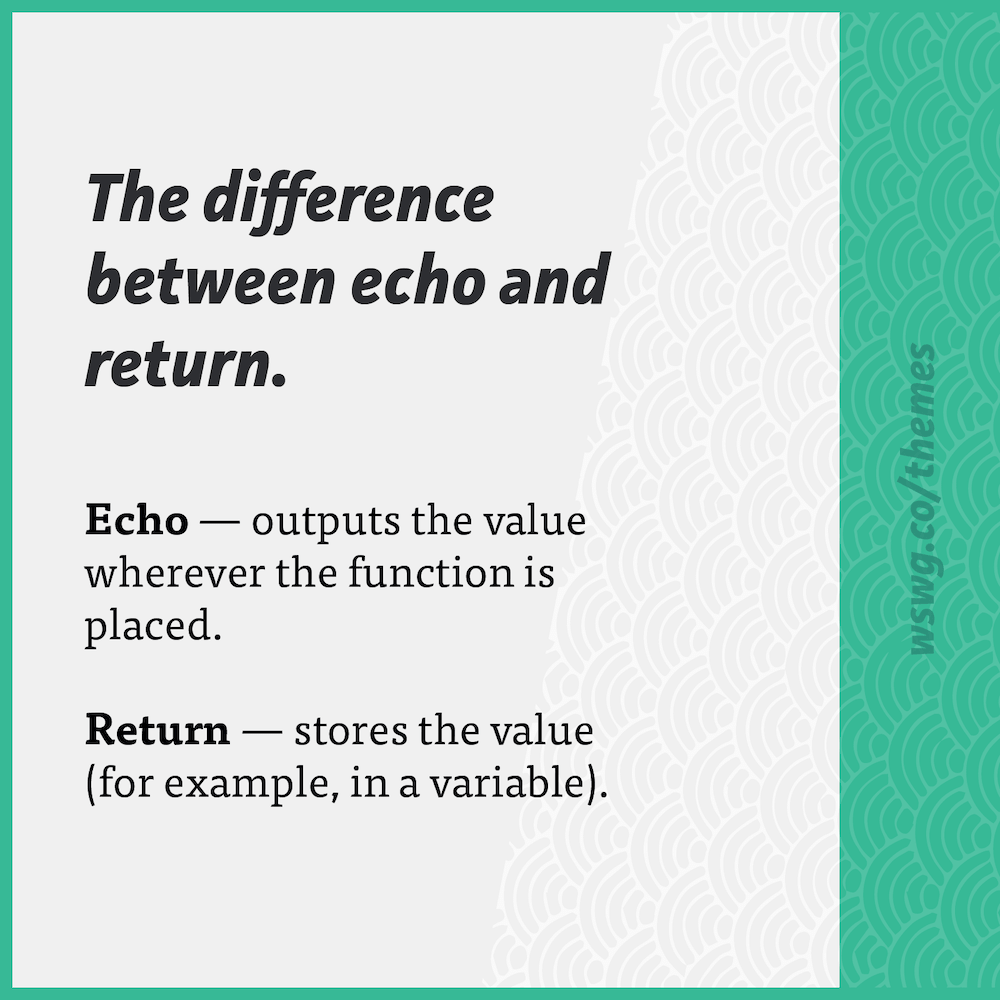
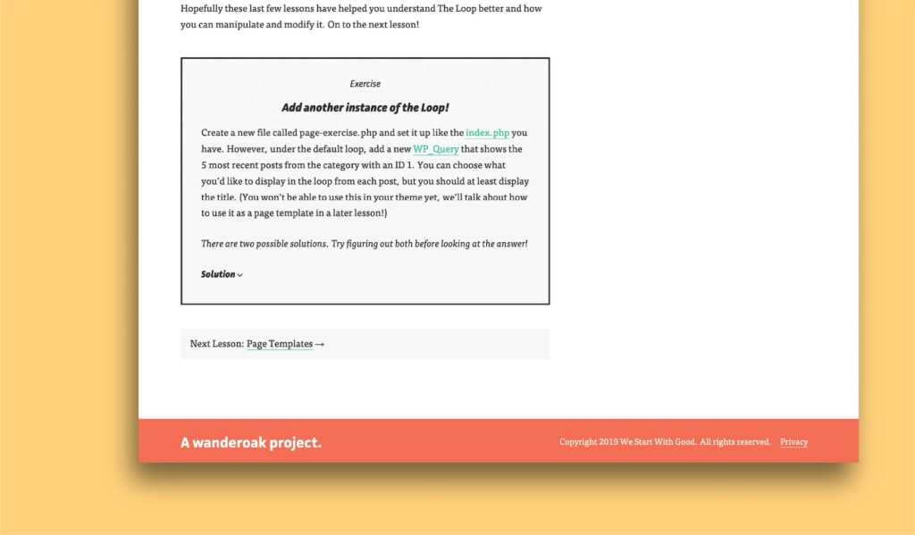
Bold headings for readability
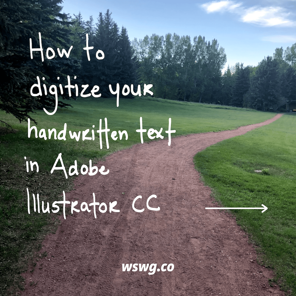
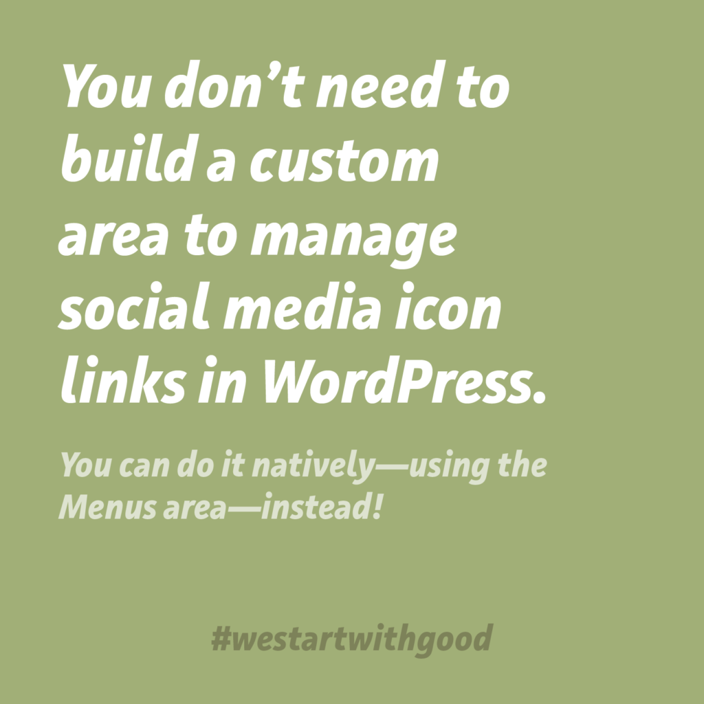
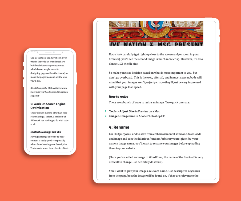
Tutorials are the primary type of article published on We Start With Good. While having visible headings is always important for readability, it is especially vital when you can expect readers to skim through for a variety of reasons:
- To see if this tutorial will actually help with their problem (it’s a common problem for ‘tutorials’ to not actually solve the problem, just explain it and potentially ask for your email in order to receive the ‘guide’)
- To skip to the section of the tutorial that has the information they need to get unstuck
- To skip around through the tutorial while troubleshooting a problem
I made the headings on We Start With Good extra bold and noticeable for those reasons.
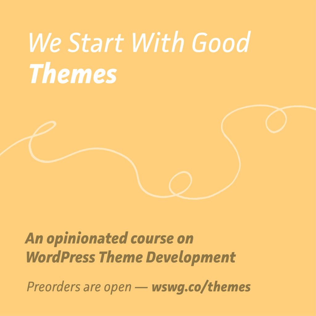
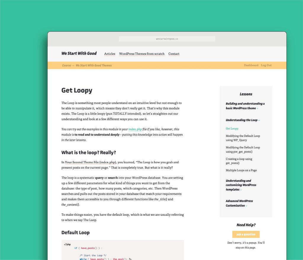
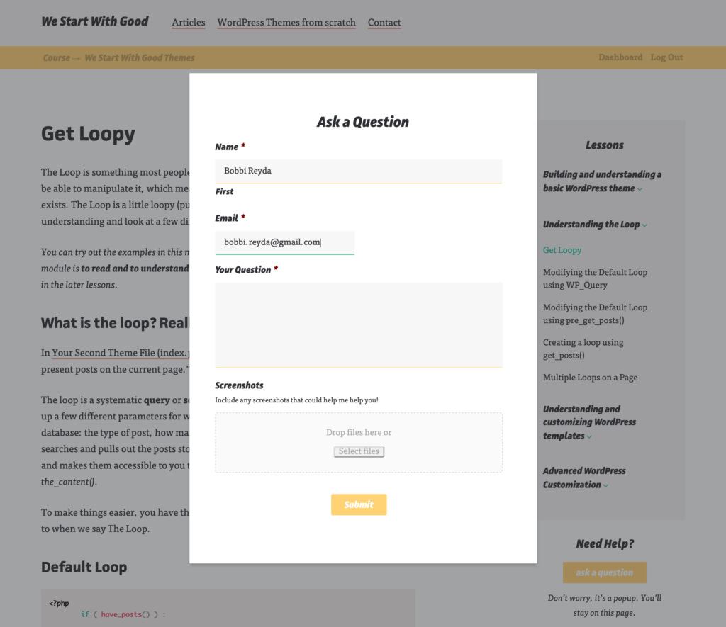
Let’s Sell a Course
After over a year of occasionally writing articles, we decided to create a course. With a paid course comes a whole set of designs to create: lessons, a course homepage, dashboard, and landing page, plus design for some extra features we wanted to include (exercises, mini-lessons, and vocabulary).
Although the course will likely no longer live and run on We Start With Good, the design is complete and nearly fully implemented (including testing with real lessons).
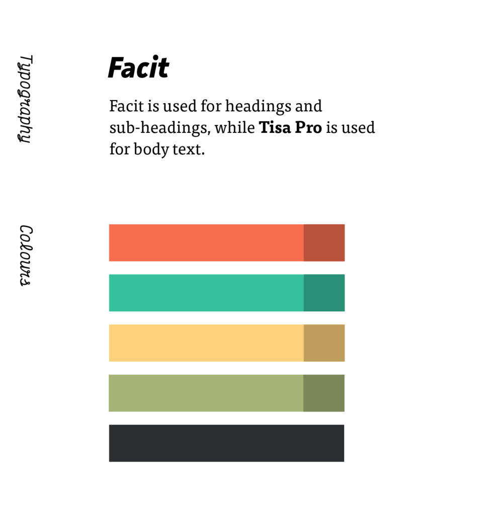
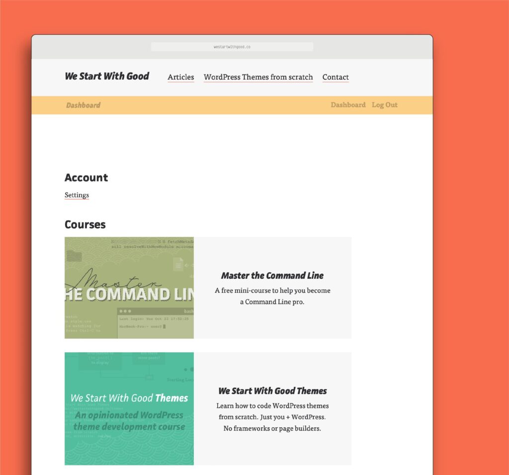
Note: I used the blue and yellow as the Course Colours. You’ll see almost no orange or green in the course content areas. This was to help students focus and make sure colour wasn’t a distraction.
Reflections
It was a joy designing elements as-needed. New design decisions were informed by the experience of the old design elements in action. If something wasn’t working, there was an opportunity to learn from it and fix it in new (and re-) designs.
For example, not only was it difficult to notice articles of interest in the original posts list, but the text was also quite large and overwhelming once the list grew. Both problems were fixed when the View Articles by Topic section was added and the homepage became more usable.