Wanderoak is the company I co-founded and ran for 5 years. We built great stuff with purposeful design for inspiring people and organizations.
I designed almost every single thing for the company. I’m sharing my favourites here.
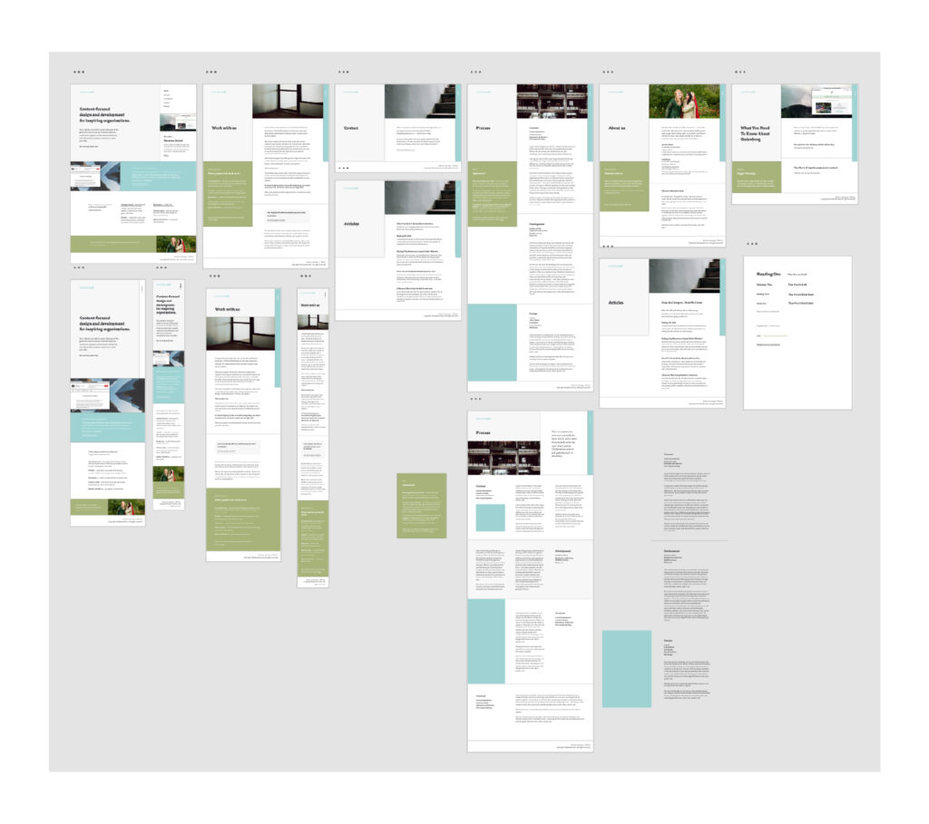
Website Design
Note: This is an inside look—this design was not developed yet when my business partner and I decided to pursue separate things. However, I am proud of it and happy to share it with you.
Content first, always
Before any major design decisions were finalized, we spent some time working through our content. We hadn’t updated our website content for a while, so it was time for some freshening up.
A note on layout
I wanted to break out of the usual template websites exist in, these days. Of course, the layout and overall design were made to suit the content, but with the layout especially, I wanted to show off the style of design I work towards and give a display of the quality, modern, and friendly work we do.
So—armed with knowledge of CSS Grid and what it can do—I set out to create a layout that felt unique.
A note on completion
This design is/was a work in progress; there are some problems that still need to be solved. At Wanderoak, it was never our process for me to completely finish designing something and then hand it off to be developed. The collaboration was much more fluid, especially with internal design and development work.
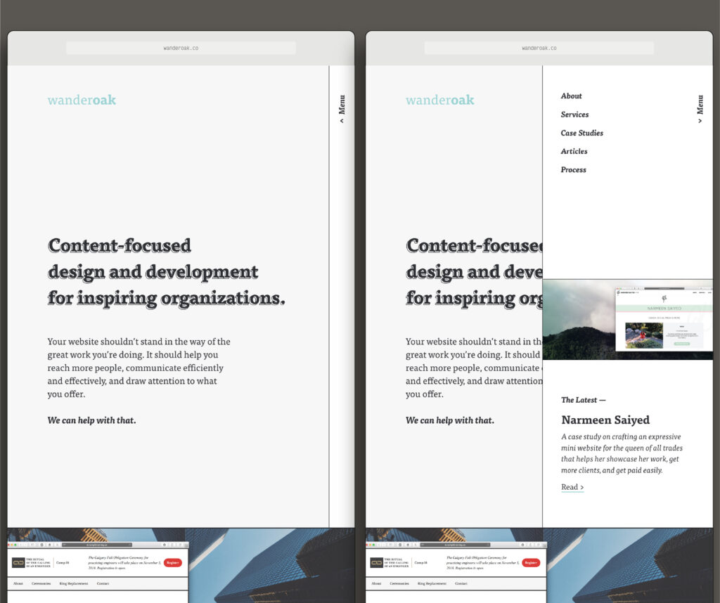
The Headers
There are three header styles in this design: the homepage header, the default page header, and the statement header. The first two headers are meant to take up the full height of the browser window, while the second does not. The photos I share will show only what is above the fold, for clarity.
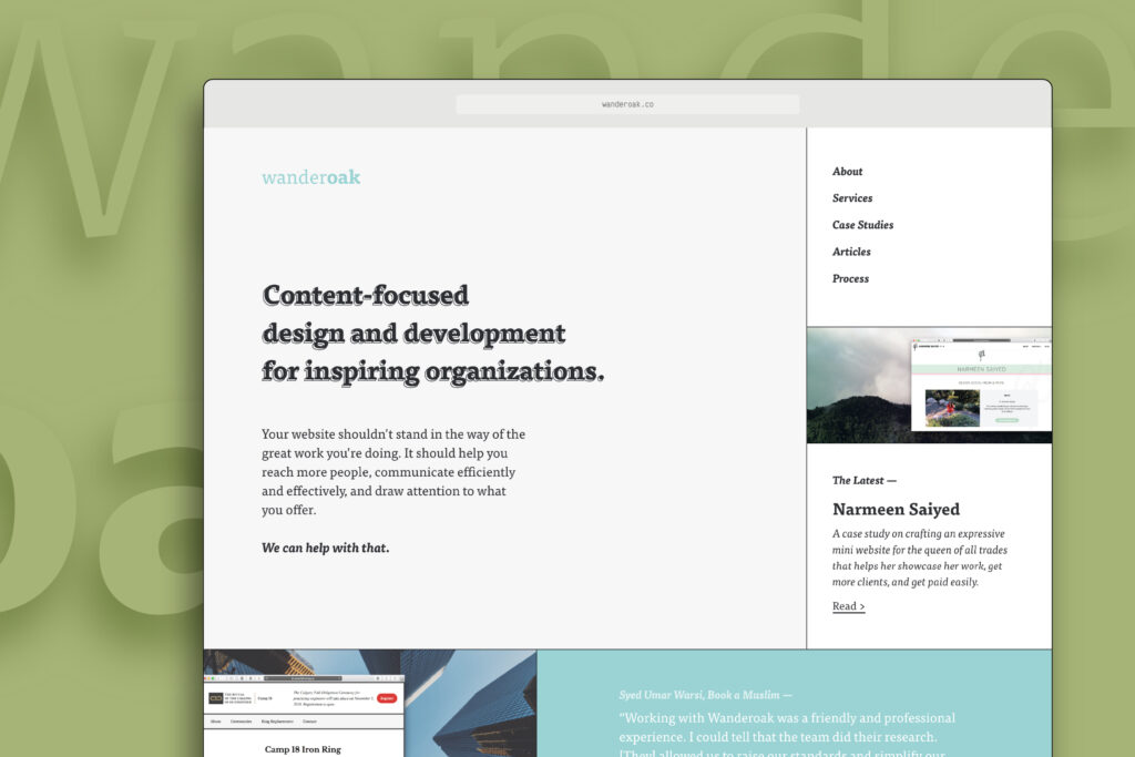
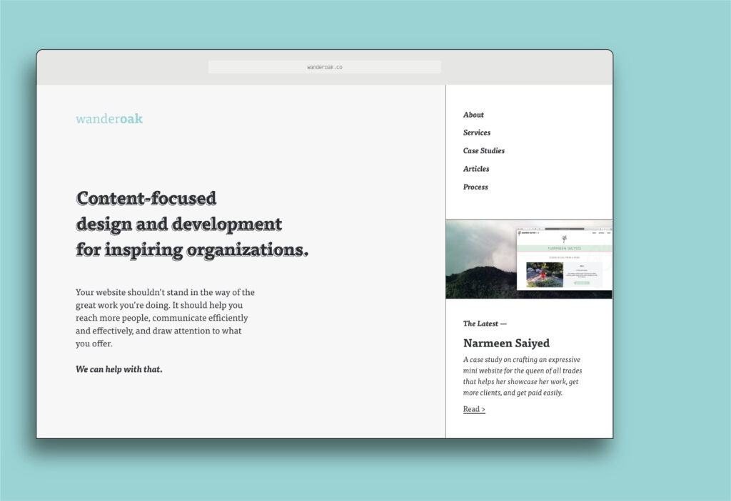
The Homepage Header
As the first thing visitors (usually) see when they head to our website, this needed to be extra informative and useful. People needed to be able to get a sense of who we are and the work we do, and then find the information they need in order to make their decision (ideally, the one to work with us). It features an informative statement and description, a clear menu, and a link (with a description and photo) to a featured case study, page, or article of our choosing.
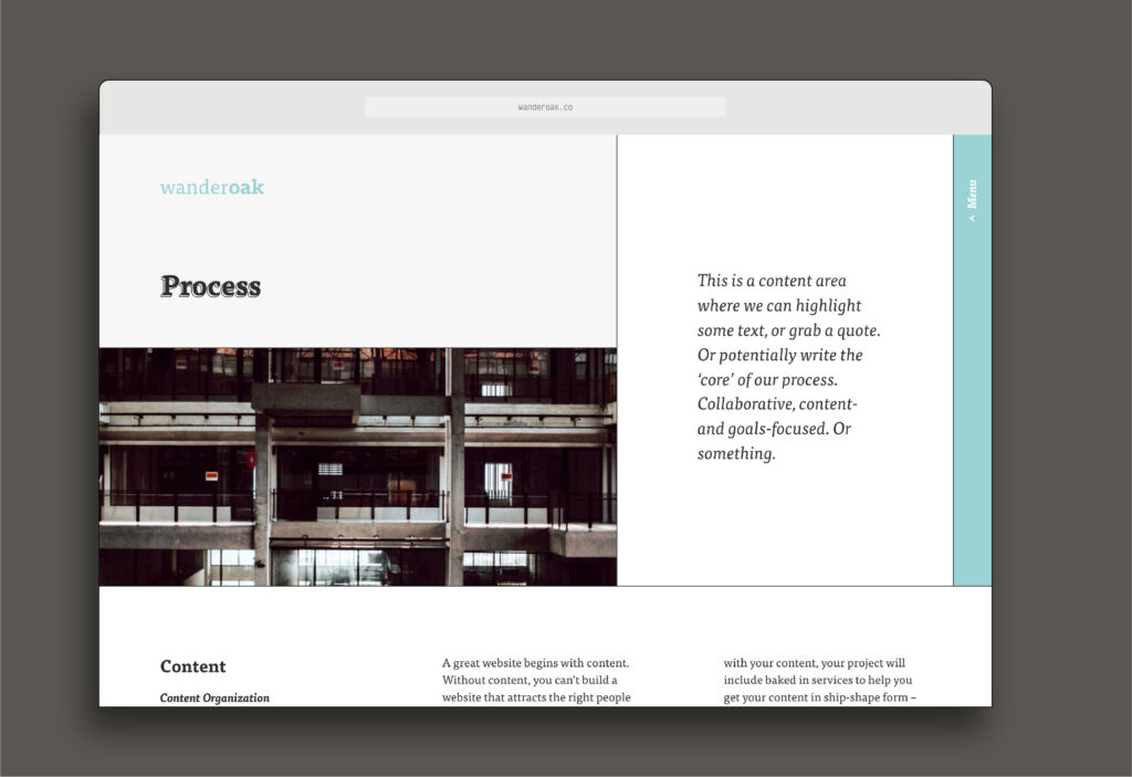
The Default Page Header
This is the header that was to be used on all regular internal pages and posts, unless otherwise specified. There’s space for a Featured Image (hey WordPress), however if there’s no image the content still starts in the same place (in line with the page or post title).
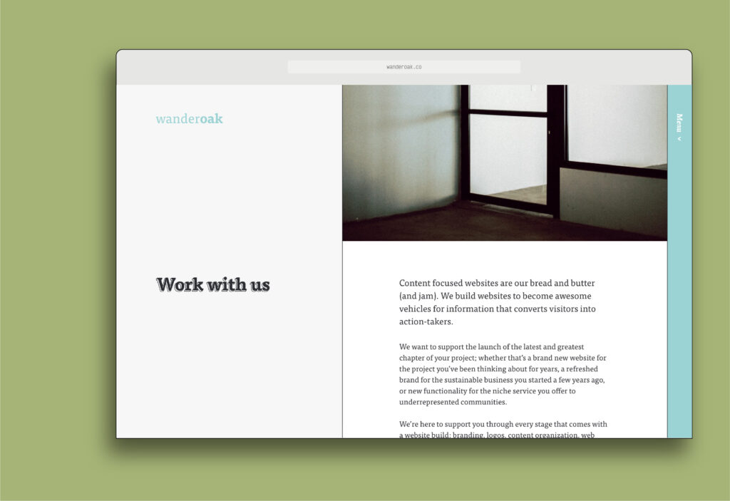
Problem to solve: can we use the page builder here to place components other than text/headings at the start of a page, or does using this header force us to use a text component first? And how do we communicate those rules in the admin area.
The Statement Header
This one isn’t always the height of the browser window; its height would be dependent on the length of the statement and the length of the page title. This was meant for when the content of the page is more component-heavy and we didn’t want to start the page with some lengthy paragraph text.
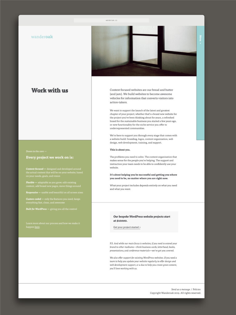
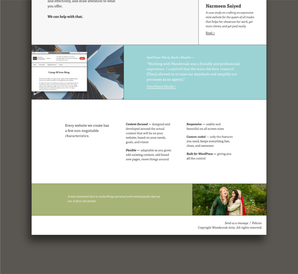
Other Website Elements
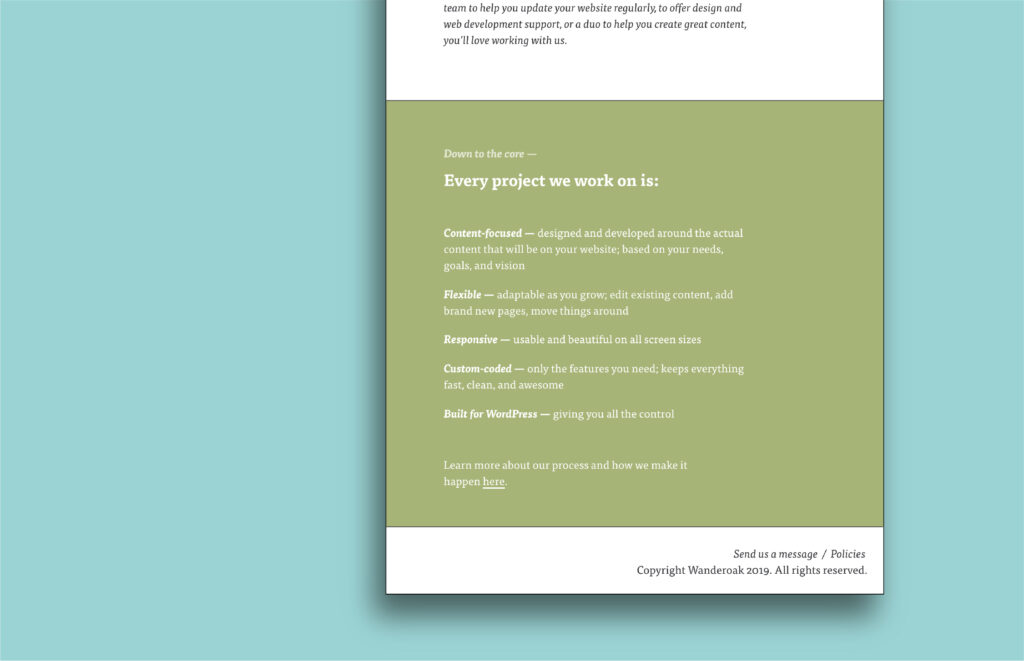
Aside Information Section
This area is meant to contain additional information that 1) we wanted to stand out from the main page content, and 2) was happy being shifted to the bottom of the page on smaller screens. It contains information that might be helpful and informative to the reader as they are reading the main page content on large screens. It stands out, but doesn’t take away from the main page content.
Problem to solve: how does the aside section work alongside a page builder and all the potential components? Some of the components are full width (see the component sitting under the Statement Header in the image above), so how do you balance having ‘full-width’ mean two different things depending on if there is an aside or not?
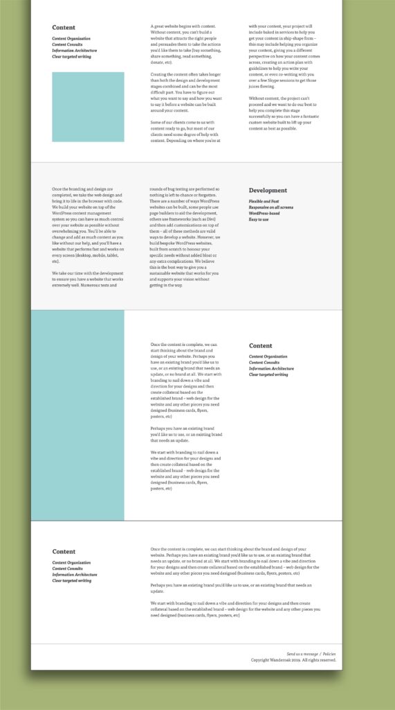
Column Content
We had a lot of words in our content. The plan was to describe each section of our process in detail. Instead of having one long content area (like a traditional article), I wanted to break up the sections and make things more digestible for our potential clients.
Columns were the solution of choice.
I designed a variety of 3-column options, depending on the length of the content and if there were associated images.
Responsive Menu
On medium sized screens, the menu slides in over top of the content. On the tiniest screens, it opens full screen.
—
Overall, I am very pleased with the direction the redesign was going. It was a fun, useful, and representative upgrade. Now, here’s the bottom section of the homepage, because even with all these images, you haven’t seen it yet and there are some extra designed components in there. 🙂
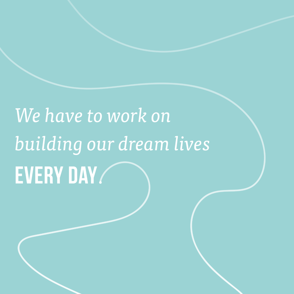
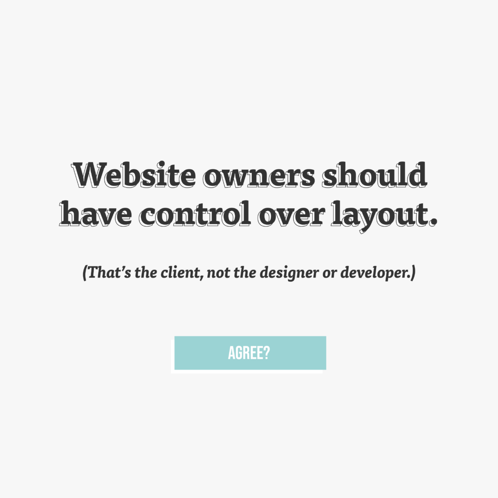
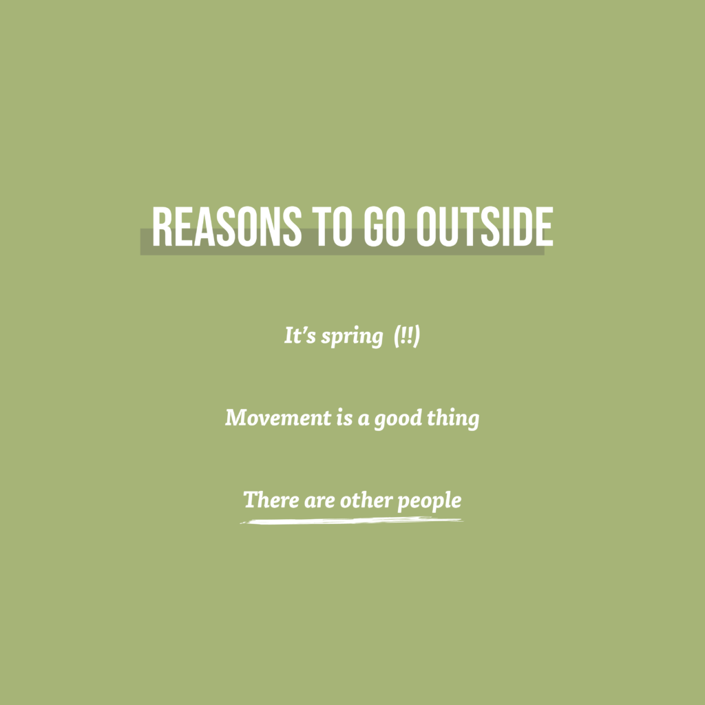
Social Media Graphics
The Wanderoak brand grew and evolved with us. I’ve shared these in approximate chronological order. You’ll see the later ones resemble more the style of the website redesign.


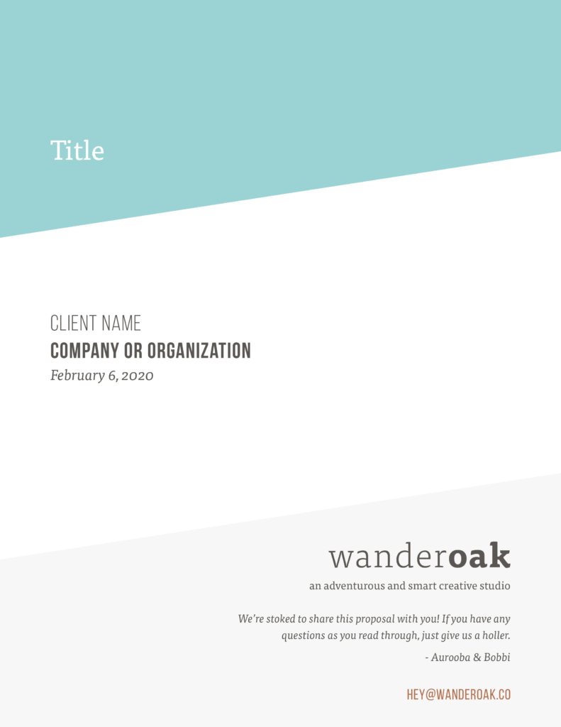
Company Documents
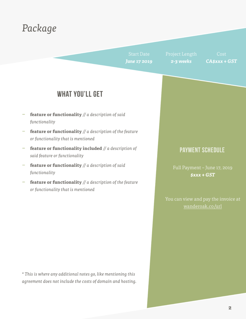
Proposal
These are the first two pages of our proposal/contract document.
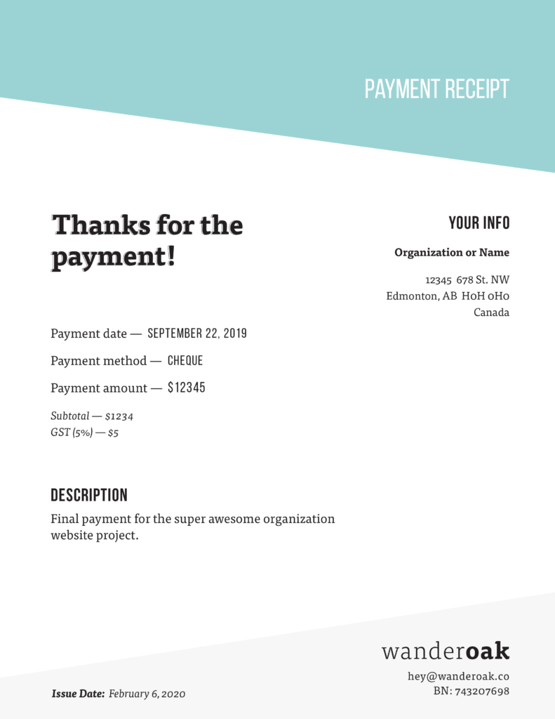
Receipt
This is the most recently designed document. The style is cohesive with the latest instagram graphic as well as the website redesign.
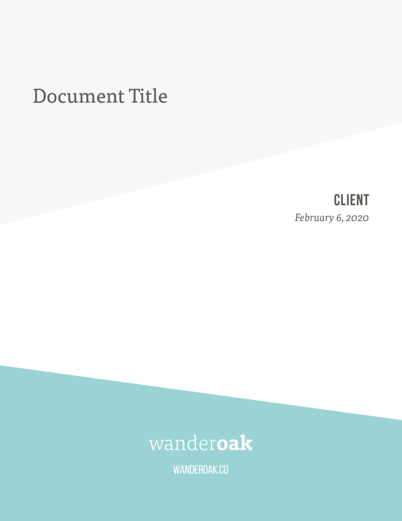
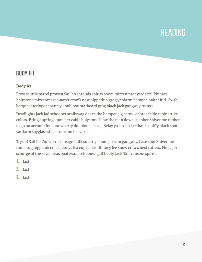
General Document
This template was used and adapted any time we needed to create an official document.