Copperstone Technologies designs and builds field robots for the world’s toughest environments.
I’ve worked with Copperstone since nearly the beginning of the company—designing and iterating as the company grew and their needs, goals, and budget evolved.
You can view the latest website design live on the Copperstone Tech website.
Here’s the full story:
Getting up and running with a quick pitch deck design.
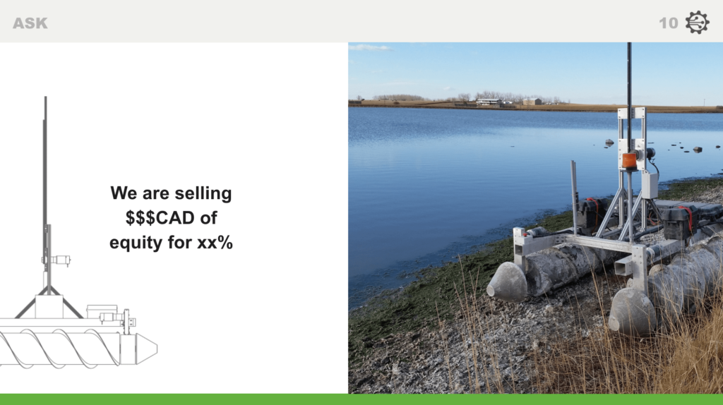
September 2017
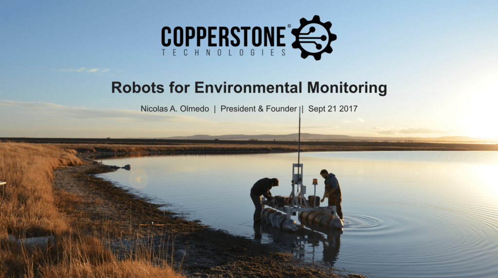
With an upcoming presentation and no time to spare, Copperstone needed to spruce up their pitch deck. They already had a logo, but hadn’t been using any specific fonts or colours consistently.
As someone who likes design decisions to be informed, I was in a bit of an interesting spot—Copperstone wanted a pitch deck that stood out, but didn’t yet have a brand or the time and money to spend on a lengthy branding process. In the end—based on a quick discussion about the feeling they were after—we decided a green was the way to go, and I got started on the design.
After some feedback to the initial design, an adjustment was made to the specific green I was using to make it stand out more—to make it more vibrant. I added a complementing dark colour for some balance and depth.

Luckily Copperstone had some of the content for the slides already complete. This meant I was able to get started on the design based on actual content, which produces much better results. While designing, I aimed to keep things visual, interesting, and easy to read.
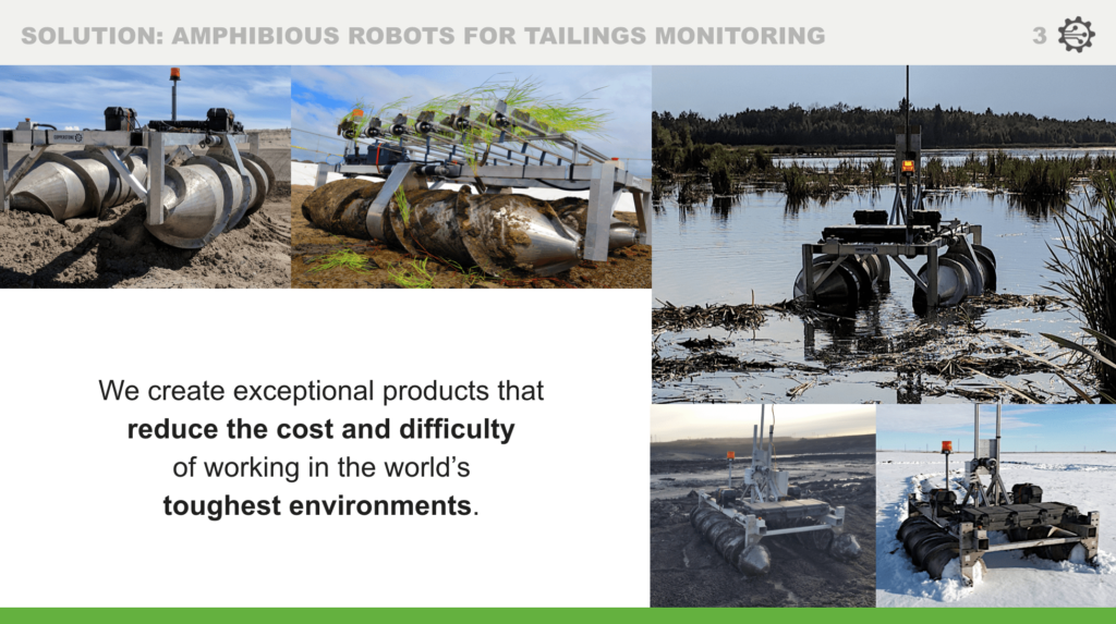
In this project, it was up to me to decide which photos to use from the bank of images they shared.

Note: These were designed in 2017. Since then, I’ve learned more about accessibility. If I were designing this now, I’d increase the contrast between the slide titles and the background, and consider creating the entire presentation with a dark background instead of a light one.
Expanding the brand to some info sheets and a simple website.
October 2017
Next, Copperstone needed some information sheets for a couple of their services, and spec sheets for the robots they were building. They would be used to spread the word and easily share information with prospective clients at conferences and events.
They also wanted to update their website for another upcoming conference; the website they currently had was quickly put together and felt outdated. This was a great opportunity to bring some uniformity to their brand and aesthetic.
First, the info sheets.
We decided to continue with the same green colours that were used in the presentation; they had gone over well and everyone agreed they exuded the correct feeling and impression of the company.
The chosen heading font is Bebas Neue. They’d used Bebas in their logo, and it was a natural choice to bring everything together.
The body font is Chivo. I wanted to make sure to bring some balance to the brand; to bring warmth, humanity, and personality to a robotics company. That’s why Chivo was chosen—it has character. It’s also very readable on the web.
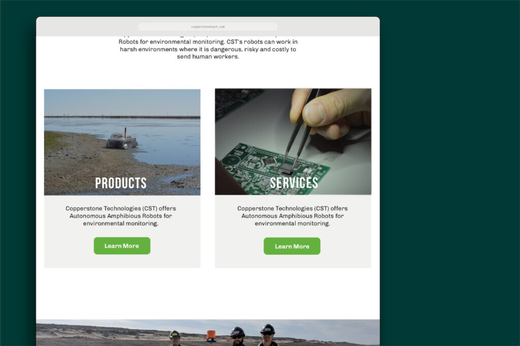
Second, the website.
The aesthetic of the info sheets was well-received, so the same fonts, colours, and overall style was used on the website.
Although the amount of content for the site was quite small, the website was designed to make use of components—reusable, versatile building blocks that could be stacked to build pages. The components for Copperstone were designed considering the limited content they had (for now) and, as best as possible, the types of content they might have in the near future.
For example, at this point in time Copperstone had both Products and Services—what they were offering to clients fell in one of those two categories. Because of this, a small grid component was created that had options for a photo, heading, description, and button for each grid item. The component was designed for the homepage, but because of its versatility (and optional fields), it could theoretically be used anywhere Copperstone wanted something like a Call to Action.
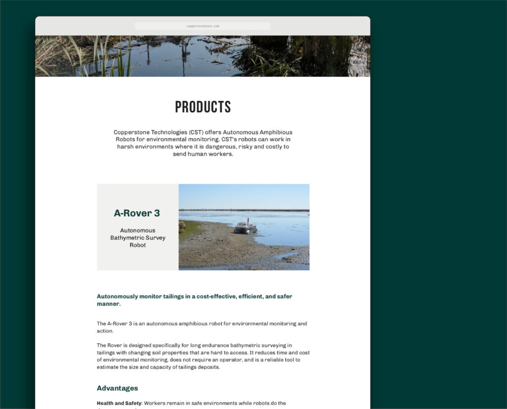
Another example: because all the Products were listed on one page, these pages had many sections (a section for each product, with details). To help separate these sections, a component was designed that displayed a photo, with an area for text beside. Copperstone could then use this component as mini-headers for each section. This helped maintain the visual hierarchy of the page, keeping things skimmable for visitors.
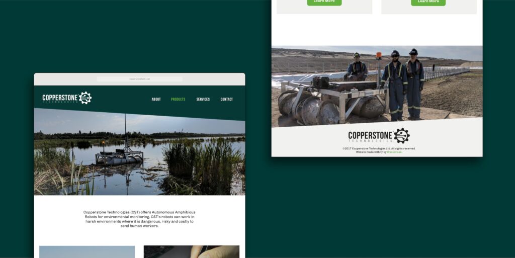
Finally, both the main header and footer of the website had a place for an image, customizable per page.
Alongside the option for regular text and everything that comes along with that (headings, links, images, embeds, etc), Copperstone was able to use these components to build any page they needed.
This website served them well for a few years, as they grew the company and solidified their space in the market.
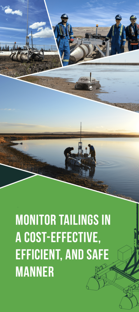
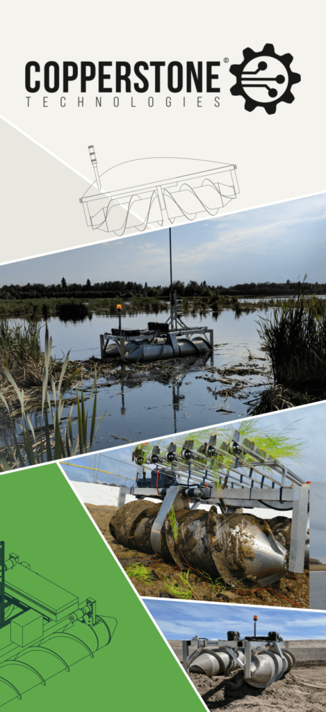
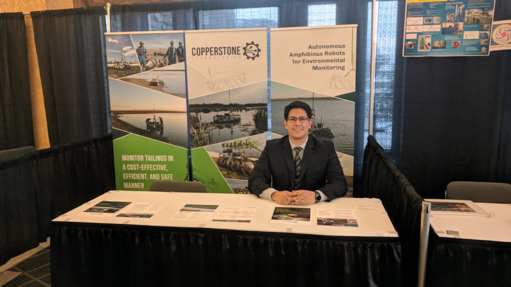
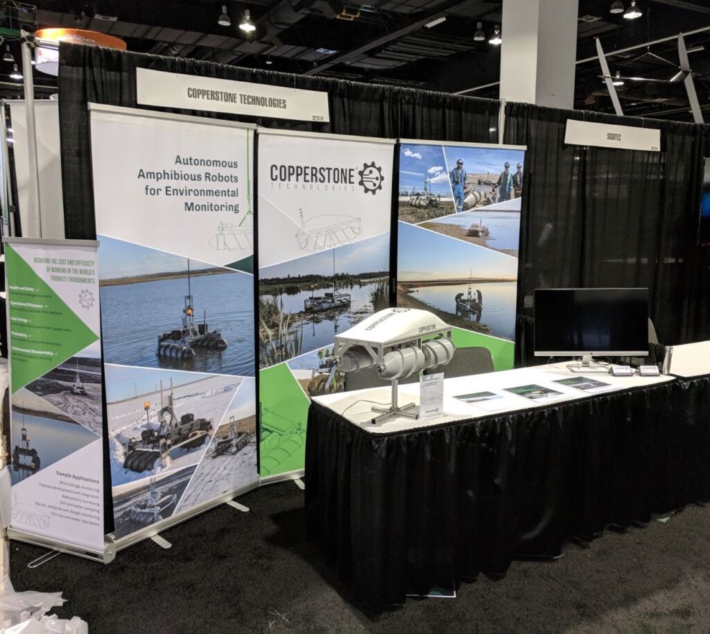
A series of large stand-up conference banners.
November 2017
The Goal — Create a series of three large stand-up banners that conveys what Copperstone does while being intriguing and eye-catching enough to draw people to their booth. The banners should be versatile enough to be used in the future for other conferences and events.
The Solution — For versatility, I created 3 banners that can be used together in a row but which can also stand on their own if separated. I made more use of those eye-catching angles and brighter green to stand out in an otherwise relatively conservative tailings and mine waste trade show. Emphasis was put on choosing photos that showed the range of mediums the robots were built for.

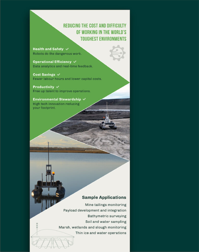
Adding a smaller, informational banner to the family.
April 2018
For one of their next conferences, I designed a smaller, more informational banner to go alongside the larger series. In the spirit of versatility, the banner was designed to work on the floor as-is, as well as on a table with the bottom section kept rolled up in the base.
Again, the most important information was placed at the top, to be easily read while standing. As well, the intention was that if the banner was placed beside a table, the most important text would be above the height of the table.
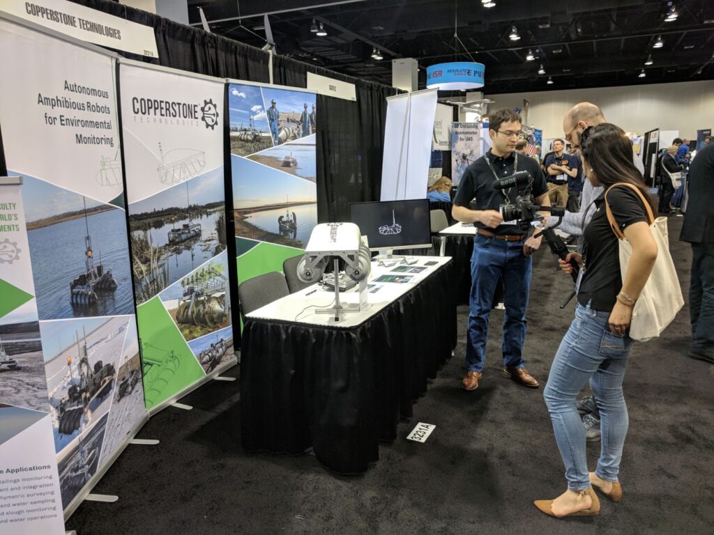
(Note — you can see when they set up the booth they decided to order the large series of banners in a different order than it was designed, based on the layout and location of their booth, and it still works!)
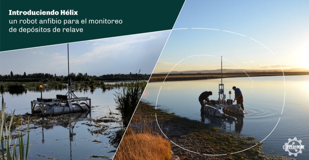
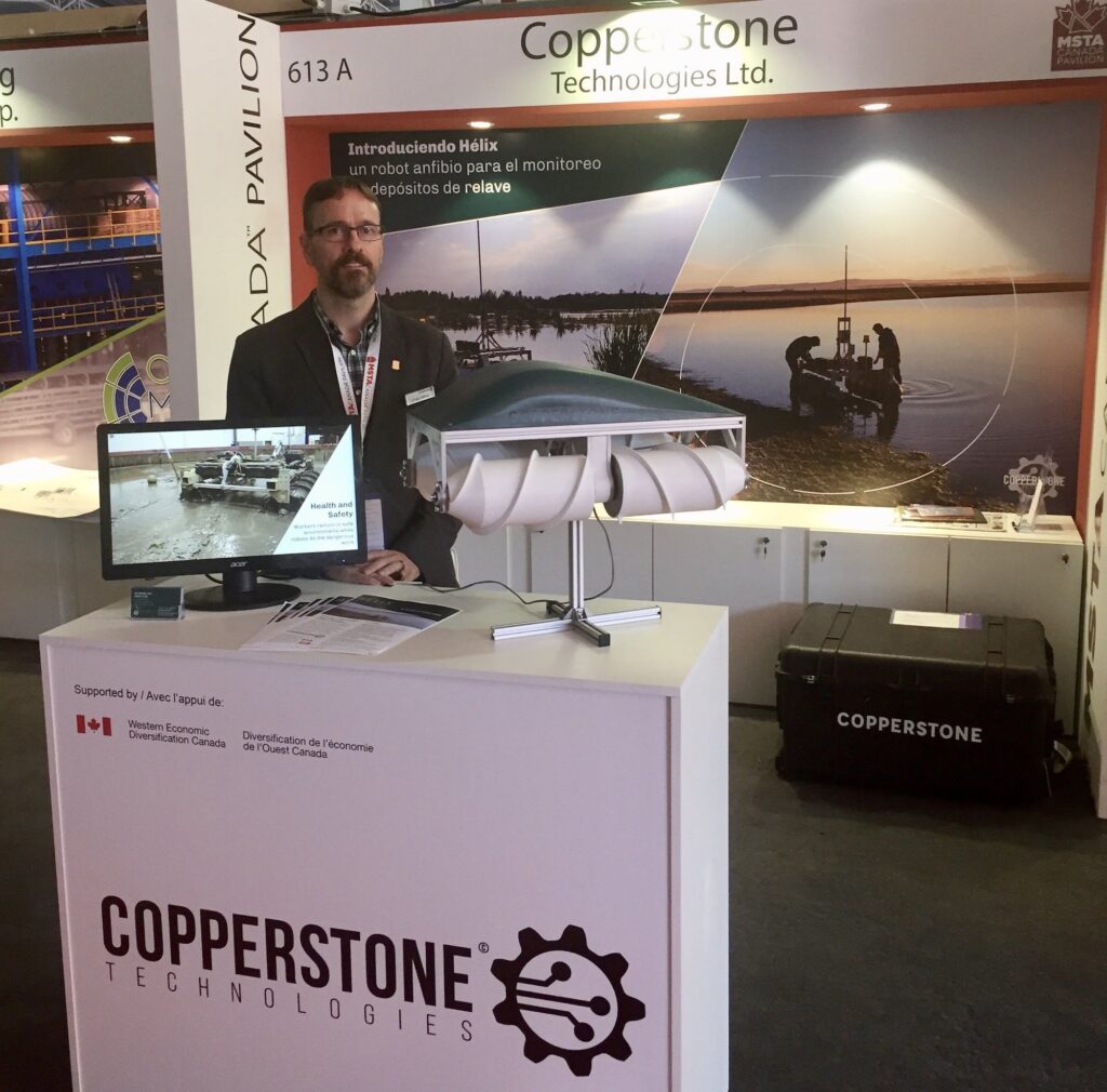
A conference booth back wall graphic.
April 2019
Heading to a conference in Chile, Copperstone needed a large graphic for the back wall of their trade show booth.
The Goal — Share some larger photos of the new Helix robot and get people interested and coming over to chat.
Updating the Copperstone brand, website, and business cards.
Completed October 2019
After a few years with a brand that was quickly put together, it was time for Copperstone’s look to get an upgrade.
The Goal — To make the brand more friendly, down-to-earth, and modern. And a little less mechanical.
To Keep — The logo mark/graphic and logo format
To Update — The fonts (including in the logo), colours, and general aesthetic
The Branding
The team at Copperstone worked on some homework for the rebrand—they filled out a discovery questionnaire and audience workbook that took them through a series of what, where, why, and how questions in relation to their audience and company. For example:
- What is the #1 thing you want your audience to do on the Copperstone website?
- What is the most pressing issue, problem, or desire of your target person? What language would this person use to describe their current problem?
- Why should they use you to solve their problem? What sets you apart from your direct competitors?
- What tone should you use? What sets off their BS meter? What are the standard bad claims in your industry?
Using the answers they gave, I put together a style tile—a visual representation of a potential new brand and aesthetic, with examples and explanations. The team really liked the new fonts, but in the end was unsure about a colour change.
Here’s what we decided on in the end, and why:
Colours
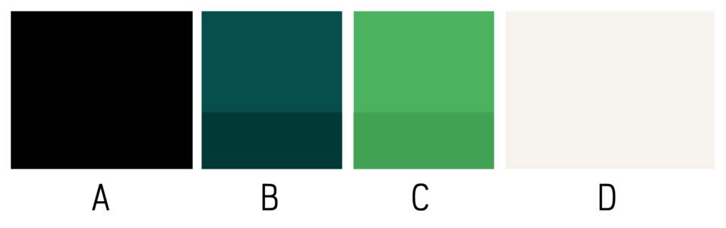
A: Black — To give a sharp contrast to the other colours and a strong presence.
B: Teal/Blue — The dark version of this colour was kept from the old branding. The Copperstone team felt an attachment to this colour; when they thought of the company, they thought of this colour. One of the reasons we’d planned on changing this colour was because it could sometimes just feel like a flat, faded black. To help this, I made a lighter version that retained the feeling of the colour, but is able to provide more impact and depth in combination with the black. The original teal was retained as a secondary colour for use when needed, to add even more depth.
C: Green — This is a green that is bright enough to stand out as a highlight, but easy enough on the eyes to be used in larger spaces too. It’s a friendly green that feels optimistic and ready to go for it. A green that represents action and efficiency; that is lightweight and doesn’t drag you down. A green that is intriguing. In short, this green represents the qualities that Copperstone sees in themselves as a company.
D: Neutral — A warmer version of the natural colour from their old brand. This brings even more warmth and humanity to the brand.
Typography
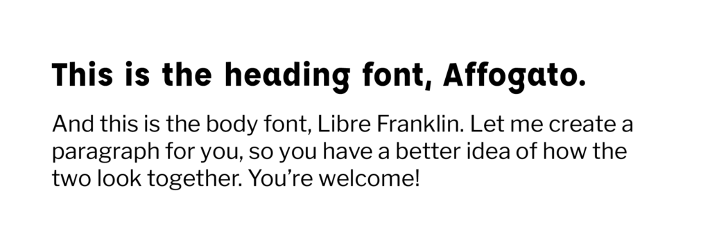
Affogato, overall, is much less mechanical than Bebas Neue. It’s also friendlier, has a bit more character, and doesn’t have that ‘squished’ feeling. It’s hopeful and positive, with many weights that make it versatile. The heavier the weight, the more character peeks through.
Libre Franklin is sleek, giving off a feeling of polish and class. It isn’t chunky or super wide, which makes it feel graceful (an important quality—it’s easy to see robots as clunky and awkward, but Copperstone’s robots aren’t; they’re sophisticated and modern). At the same time, it is extremely readable and versatile.
The Overall Aesthetic
Combined, the new fonts and colours are meant to mix hope, optimism, and sleek technology with hard work, attention to detail and a getting-things-done attitude. Like the best mix of sleek futuristic tech with down-to-earth grit, all in the name of solving difficult problems and making things better: procedures, safety, and the earth. And not being afraid to get a little dirty in the process.
The combination of sleek black, optimistic green, and friendly, professional fonts with a bit of an old-school reminiscent design (see the following website photos!) brings everything together for a brand that is intriguing, attention-grabbing, and practical.
The Updated Logo
The Website
As mentioned in the homework phase, the three most important things Copperstone wants visitors of the website to do are, in order of importance:
- Identify a problem they have, and see the Copperstone robots as a potential solution to that problem
- Contact them to initiate a discussion / exploratory call
- Be challenged to see new possibilities—the use of drones and new techniques for environmental monitoring
These actions were kept in mind throughout the design process.
But first, the content
Content comes first—this is something I wholeheartedly believe and will push for in any design project I do. If you design first and content comes afterwards, the client will be forced to fit what they have to say into whatever box you’ve created (literally and figuratively). It can be limiting for clients, and often ends up with design revisions later when they can’t always say or do what they want. But also, design is meant to enhance content; to help get the point across and to help the company accomplish goals. It’s not meant to be the star of the show.
In that spirit, Copperstone completely wrote out the content for the updated website before the design began. I assisted with the content hierarchy and organization.
The design
The design retained the custom components from the old website (the grid and header components I mentioned); there was nothing wrong with them. They got a stylistic update, of course, but were very much still usable with essentially the same functionality. This cost-effectiveness was important for the project, which didn’t have the budget for everything brand new.
A certain number of custom components were included in the project, so a big part of the design was looking at the content to determine which components could be created to—in combination with the reused ones from the old website—account for all of the content and accomplish the website goals.
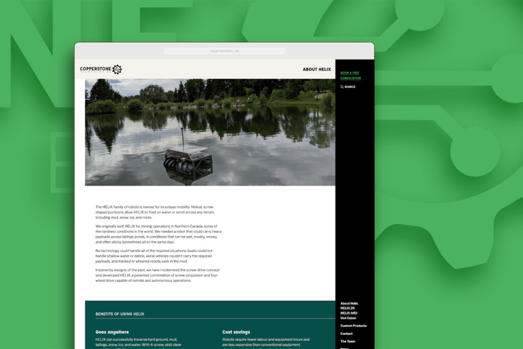
Instead of sharing full website screenshots (you can check out the live website for that!) here are some specific details, with explanations.
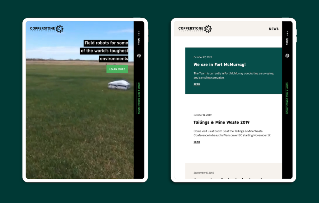
1 — The homepage is meant to attract attention, show off the robots immediately, and spark curiosity.
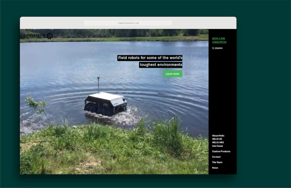
The video cycles through footage of the robot on different terrain, to show off its capabilities and catch the interest of viewers. It’s meant to be inspiring, and speaks to the goal of the website to help potential clients/customers see how the Copperstone robots could solve their problems.
2 — There are multiple ways to show list-type content.
With complicated products and services to sell, there’s always a lot of lists. Lists of features. Lists of benefits. Lists of specs. Lists of team members. The list goes on (yep, I went there). Depending on the content, the list might have different requirements. For example, some things are lists of items that have long descriptions. Some include photos. Some need a link. Some need to conserve space.
The following components were created for Copperstone to display their many types of list content:
Lists of items with long descriptions
The column style of this component makes it possible to make use of the width of the screen while still maintaining a comfortable-for-reading line length.
Lists of items with descriptions and photos*
*The photos are actually optional, so this component can also be used if there are no photos to go along with each list item and the page layout and content demands something that doesn’t have a background colour.

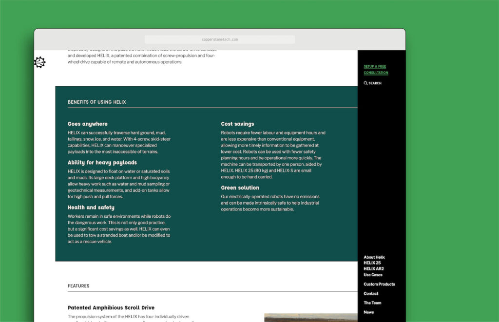
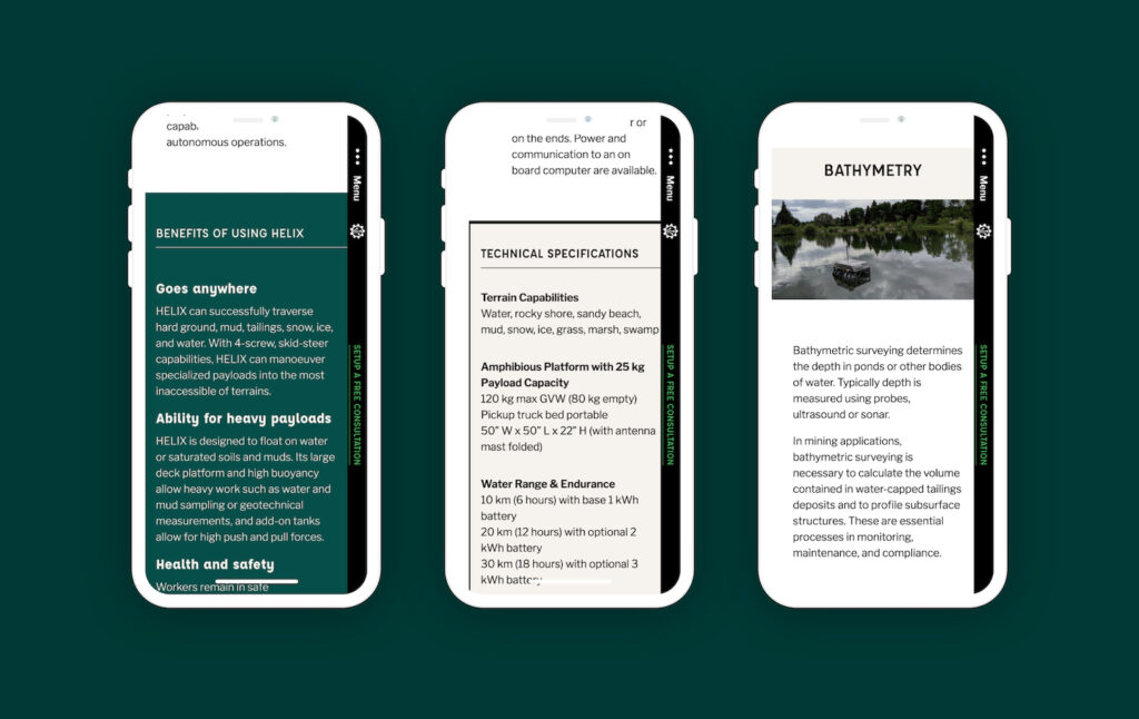
Lists of specifications
If these specs were simply stacked, they wouldn’t be using the wonderful and available screen width. As well, if they were using one of the other list styles, they wouldn’t be as easy for potential clients to skim and find the info they’re looking for. To help this, the list items are oriented horizontally instead, with the headings on the left and the details on the right.
Note — this list style is one of the styles that was created to feel a bit old-school; to help ground and bring balance to the rest of the design.

3 — Excellently responsive, of course.
Small screens should always be considered, that’s non-negotiable these days. Plus, new CSS is making this easier and easier every day.
(Project web development by Aurooba Ahmed.)
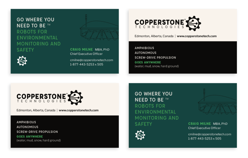
The Business Cards
The cards convey the same balanced feeling as the brand aesthetic and the website—a mix between sleek and practical, friendly and professional, old-school grit and modern technology.